


EN
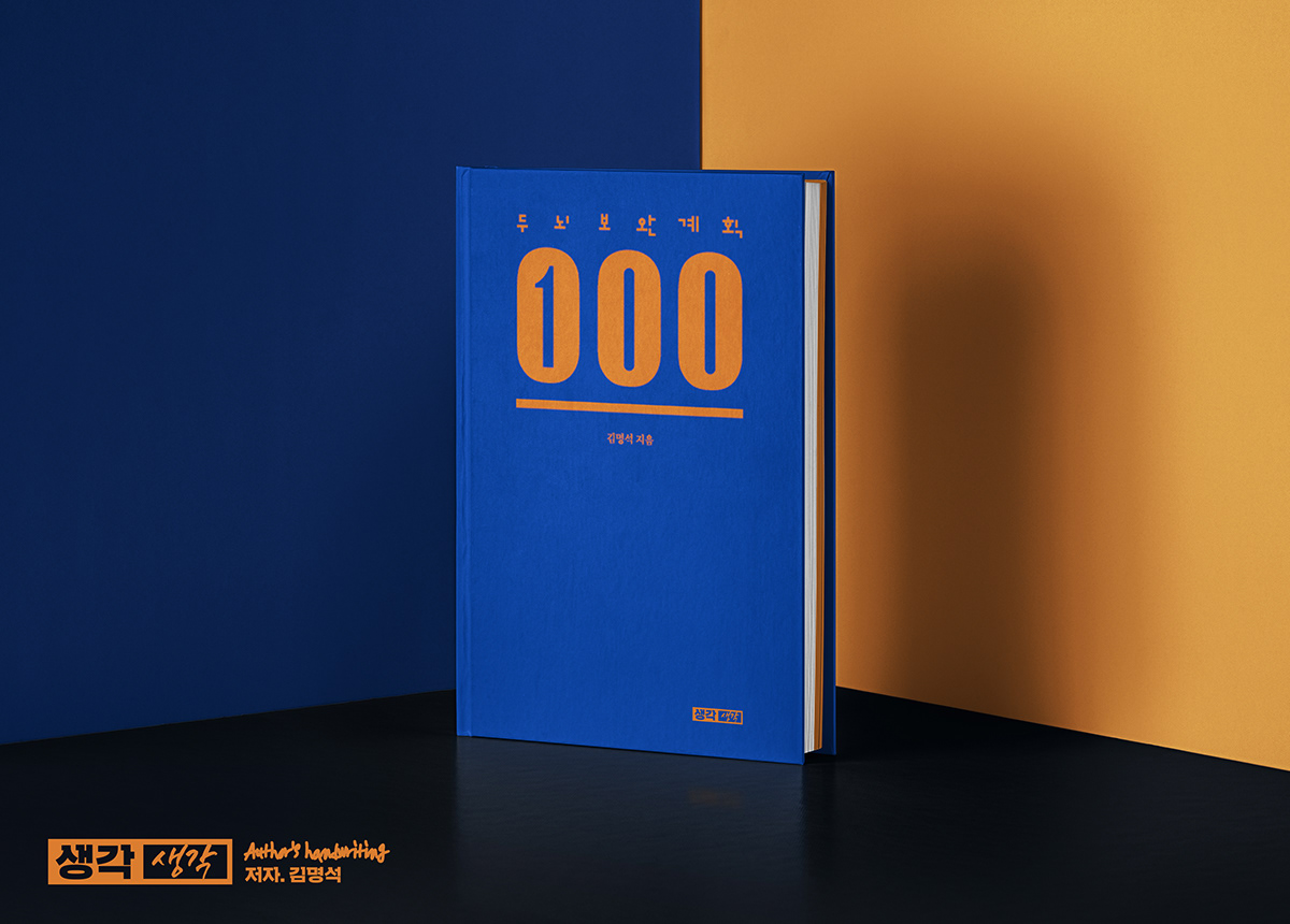
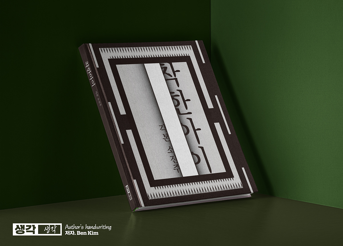
The message 'I think about thought' from the meaning of the publisher '생각생각' is used as the keyword for designing visual identity. The logo is printed on the cover of the book, so it is designed with simplicity to avoid unnecessary visual attention. By writing the word 'Think(생각)' directly in the blank space of the logo, the message of 'writer's thoughts for thinking' is intuitively revealed. As a result, each book contains the author's personality, so the publisher's logo does not harm the message of the book itself.
Since the logo is printed in small size, I used the Slab Serif Korean typeface 'Sandoll Straight Beak', which has less stroke contrast and secured readability with serif.
KR
출판사 생각생각의 뜻 '생각을 생각한다'라는 메시지를 키워드로 삼았습니다.
로고는 책 표지에 인쇄되기때문에 불필요하게 눈길을 끌지 않도록 간결하게 디자인 했습니다.
로고의 빈칸에 작가가 직접 '생각'이라는 글씨를 써 넣음으로써
'우리의 생각'에 대한 '작가의 생각'이라는 의미가 직관적으로 드러나도록 디자인했습니다.
결과적으로 각각의 책 마다 작가의 개성이 담겨 출판사의 로고가 책 자체의 메시지를 해치지 않습니다.
작게 인쇄되었을때 획 콘트라스트가 적고 세리프로 가독성을 확보한 슬랩세리프 한글서체 'Sandoll 곧은부리'를 사용했습니다.


dkeon17@gmail.com


